Bathroom series 3/4: Best Colour and Lighting Choices
Hello and welcome to number three of my Healthy Design for Bathroom series.. Each month I will be focusing on a different room in the house. This June it’s all about the bathroom and how to create your ultimate, sustainable and healthy bathroom retreat. Whether you have a redecoration project in mind or just want to give your existing bathroom a bit of a revamp, then my June blogs are for you. (If kitchens are more your thing, stay tuned for my Beautiful Healthy Kitchen series in July.)
This week I am looking at…
COLOUR & LIGHTING
COLOUR
Colour can really help set the mood for your bathroom and can have an impact upon wellbeing. First decide how you want to feel each time you use it. Is it a room you use regularly - every morning before work perhaps? - so do you want to feel motivated and ready for the day? Is it just for occasional visits by guests so could be a showstopper and a bit fun? Or perhaps your night-time routine involves sinking into a bubble bath with a scented candle or two and therefore a haven of calm is what you seek? Whatever your preference, establish how you want to feel first and then look to pick a paint colour that resonates with that feeling.
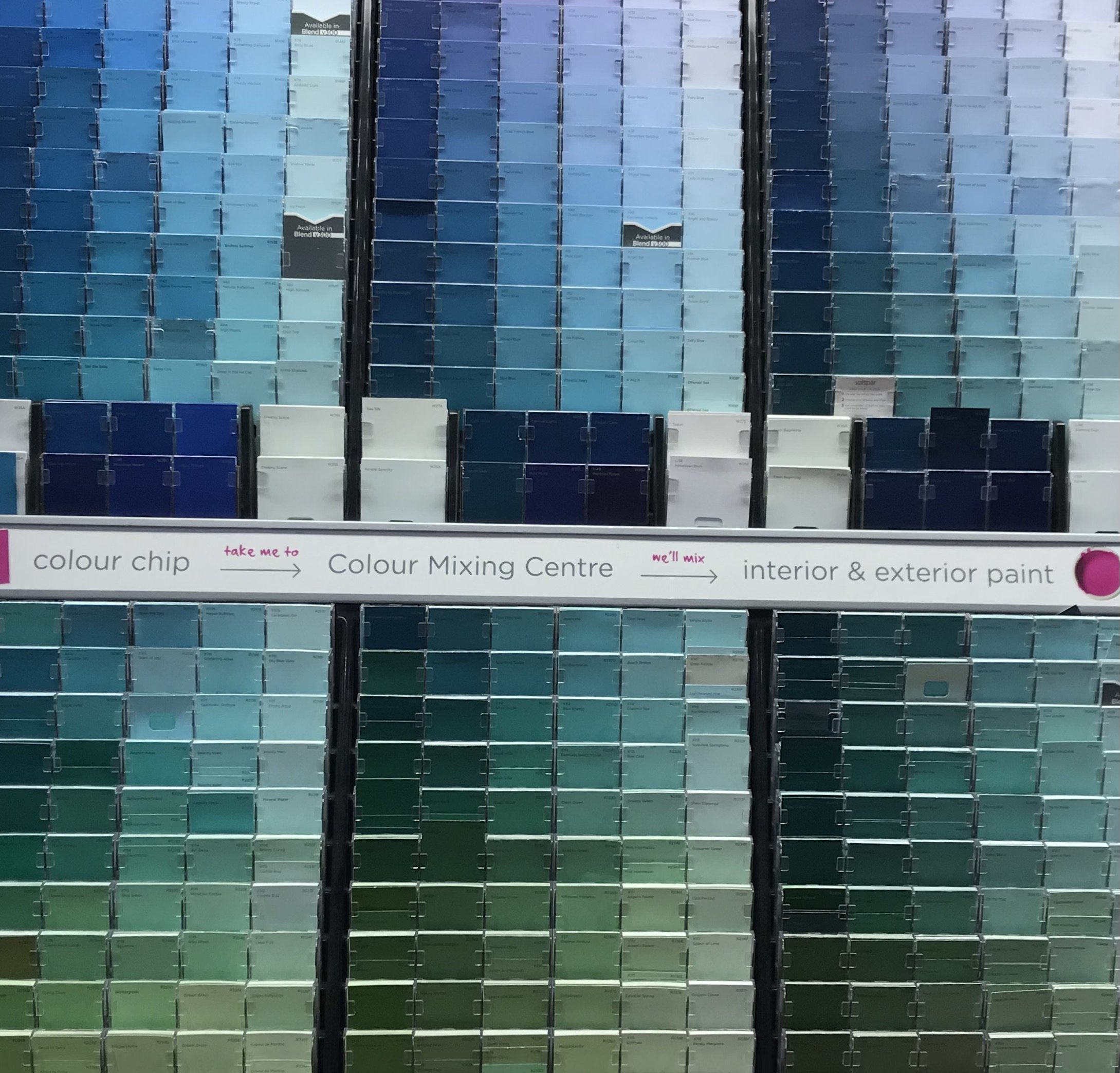
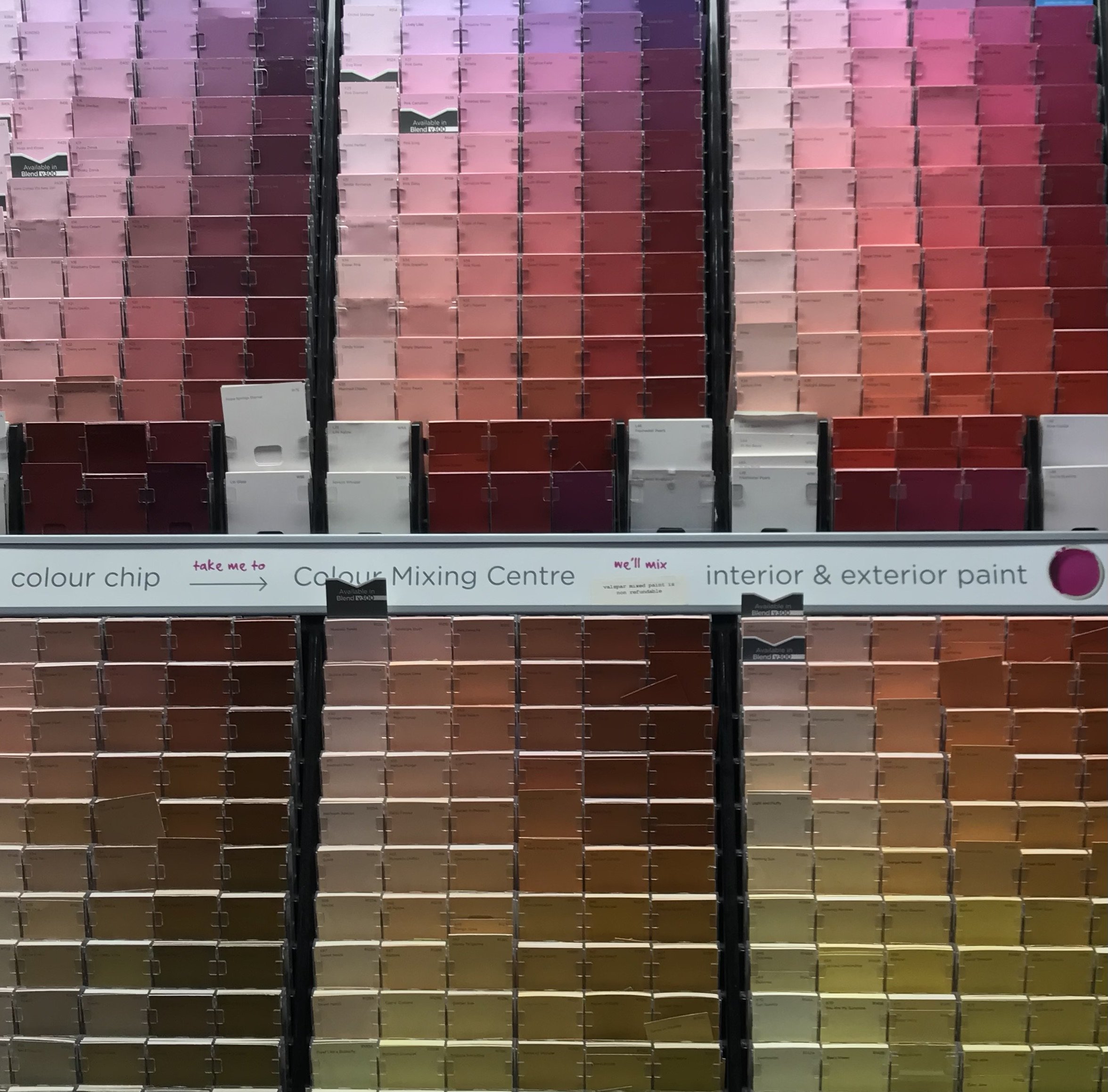
It is worth remembering that the colour wheel is split into two, with yellows and reds (and secondary oranges) seen as warm colours, with blues (and greens and indigos) as cool colours. If you want a room that feels upbeat and lively, choose from the warm side. For a more relaxing environment, choose from the cool side.
Light, cheerful brights from the Spring colour palette or striking, bold colours from the Winter palette can both help to give your bathroom a sense of fun and joy. Or perhaps you prefer the softer, more muted tones of Summer - these can help the space feel like a sanctuary.

Reds and yellows have the longest wave lengths and take the eye more effort to concentrate on, so sharpens the attention span. Therefore great when you want to feel motivated. I chose to decorate my children’s bathroom in a bright mustard yellow. I wanted a feeling of joy and motivation each morning. I paired a marmoleum floor in ‘lemon zest’ with Miss Print’s FSC water-based printed wallpaper ‘Mountains’. I smile every single time I enter this room.


TESTING PAINT
This summer the heat is pretty intense and so is the light. With the summer solstice having just passed and the light in the evening hanging around till well past 9pm, it is important to consider any paint choices you are making in different lights. We have light now in the UK from around 4.45am so that is more 17 hours of daylight. This is wonderful for our wellbeing and the availability of vitamin D, but do check any paint colours in lower and night-time light - particularly with an artificial light source, as colours change - especially the healthier paints on the market as they tend to absorb light in a different way.
Farrow & Ball paints say their single most important characteristic is…
“… the extraordinary way our deep and richly pigmented colours respond to light throughout the day, bringing walls to life.”
Always buy a tester pot. They may seem pricey, especially if you want to try out a few, but it is absolutely worth it as the colour will most definitely not look the same on your walls as it does on a tiny swatch or paint tin.


HEALTHIER BRANDS
A lot of high street paint brands now contain lower levels of volatile organic compounds (VOCs - see last week’s blog) which is great news for our health, however, not all brands are made with environmentally friendly ingredients. Trusted eco paint brands have a lower environmental impact often by utilising less water and focusing on manufacturing with a lower carbon footprint. Most eco brands are water based and also biodegradable so better long term, but not all brands are made equally. It is worth doing the research and picking a brand you like, not just for their colour palette but their social responsibility ethos, dedication to quality, long standing relationships with their suppliers and environmental outlook.
Here are some of my favourites which not only have really beautiful colours but are great for coverage, quality, eco credentials and low-no VOC levels. They are more expensive than department store paints, however you are paying for a product that will not bring any toxins into your home and you’re investing in a healthier and more sustainable future.


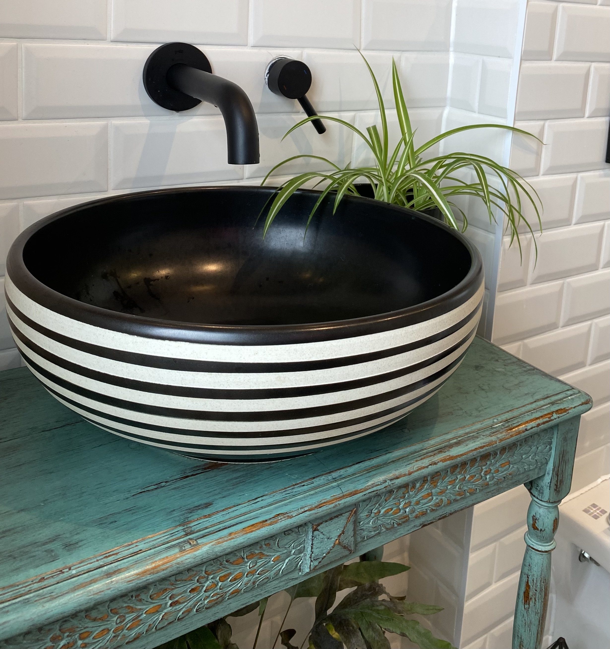
This ensuite is monochrome with black highlights coming through in the accessories - the hardware (taps, shower), mirror and lighting. To bring some warmth to this room I chose Little Greene’s Blush which is a dusky vintage pink. This colour works well against the white metro tiles and basin stand in complimentary turquoise.
If you’re just not sure and you’d like colour advice, contact me for a free chat about my colour consultation service.
LIGHTING
There are three types of lighting required when it comes to designing a room - ambient, task and general. The latter is usually provided by both daylight and ceiling pendants or spots. Task lighting is important if you intend to apply makeup or shave at a mirror and ambient is great at creating atmosphere through wall lights, when you want to relax in bubbles. As electricity and water do not mix, there are strict rules as to the types of light fittings that can be used and where they can be positioned. Refer to ‘zones’ below and be sure to use a reliable electrician when having your lights fitted.
ZONES
When adding anything electrical to a bathroom, it must comply with the correct IP rating (Ingress Protection) - which is a guide to show where electrics can be positioned in relation to the water outlets ie shower/bath/sink). IP67 (Zone 0) is total emersion proof so required on products such as internal spa bath lighting. IP65 (Zone 1) is for products above the bath area and it is good practise to also follow this for the wash basin. IP44 (Zone 2) is for products beyond an area of 0.6m from the bath.
LIGHT
The most commonly used artificial bulb light is either cool white or warm white light. The former is usually used for work areas such as the kitchen or garage and some designers do recommend it for a bathroom. However it can be quite a stark light. I would only recommend you use it in a bathroom if you have wall lights as well as a main central light. I would use the cool white in the main central (or ceiling spots) and the warmer bulb in the wall lights. This then gives you the option to change between the two quite different atmospheres.
MIRROR
Bouncing daylight around a small space through the use of a large mirror can help make the space feel bigger and lighter. I shopped around for a vintage mirror that was slim enough to fit between the two wall lights (see image above). This was originally green with a beautiful oriental floral relief in gold but black was going to go better with the overall style of the ensuite, so I carefully painted the green out in black, keeping the relief detail in gold.
ACCESSORISE
If colour in the bathroom really isn’t your bag, then adding a splash with accessories is the best way to bring a bit of life into a white room. We love these soft, absorbent, organic cotton hand towels by Wild and Stone, available in four gorgeous colours.


NEED HELP?
For those of you who are about to embark on a bathroom renovation but not sure where to start, give me a call and we can talk it through. I offer a variety of design services that suit various budgets and our first chat is completely free. Contact me for your free discovery call and let’s see how I can help make your bathroom dream a reality.
The services I offer are:
colour advice based on tried-and-tested psychology of colour and its affects on our mood;
key product sourcing that will fit the needs, space and style of your room whilst ensuring the materials are healthy and sustainable;
concept design that cover the aesthetics, functionality and health of a space with hand-drawn elevations and mood boards;
or all of this combined into a full healthy interior design service - from project planning through to completion.
NEXT WEEK
Next week sees the final instalment of my Heathy Design for Bathroom series where I cover flooring.
NEXT MONTH
Stay tuned for July’s blog when I talk about kitchens and how we can make those spaces family-friendly, healthy, sustainable and the hub for entertaining guests.
SIGN UP
Sign up to my weekly newsletter and get 10% off your first order of Beautiful Healthy homewares and natural skincare brands.
Images © Unsplash: colour tiles - Andrew Ridley
Images © Beautiful Healthy Home: pink colour swatches, blue colour swatches, tester pots and tester images, vintage mirror, ensuite, organic cotton towels,
This blog, website and its content are copyright of Beautiful Healthy Home Ltd - © Beautiful Healthy Home Ltd 2021. All rights reserved.
Any redistribution or reproduction of part or all of the contents in any form is prohibited other than you may print or download to a local hard disk extracts for your personal and non-commercial use only
You may not, except with our express written permission, distribute or commercially exploit the content. Nor may you transmit it or store it in any other website or other form of electronic retrieval system.